What is the 2021 Pantone Color of the Year and how is it being used so far?
- Jeanette Johnson
- Jan 13, 2023
- 3 min read
Color is an essential influencer in our daily lives, and Pantone is the standard for color palette selection. They influence color trends and the choices of millions. What is “Pantone,” you ask? Pantone is the industry standard for inks and color mixtures designed to print and display with accuracy every time they produce them.
Every year Pantone forecasts a color that they foresee taking the design world by storm. It influences designers across the spectrum: fashion, graphics, artists, film, interiors, and the like. Read more about the colors chosen for years past at Pantone’s website.

Now, I’m sure you’re asking yourself, “Jeanette, you’re a little late to the game here, aren’t you? It’s already March!” Well, yes. You are correct. But delaying this article gives me a chance to show you, my dear reader, how the colors are showing up thus far!
So! Without further ado, let’s dive in.
And the Color(s) of the Year Is…
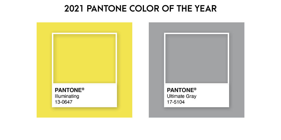
The colors chosen to influence the design world in 2021 are (drum roll, please): PANTONE 17-5104 Ultimate Gray along with PANTONE 13-0647 Illuminating.
Yup, you read that correctly, gray and yellow. Why? Hell, if I know!
Also, when I say “color” of the year you expect there to be one (1) color. This isn’t the first time that Pantone has selected multiple colors for a single year. In 2016 they chose Rose Quartz (13-1520) and Serenity (15-3919).
Adobe’s executive director of the Pantone Color Institute, Leatrice Eiseman, explains on their website that pairing the gray with yellow “expresses a message of positivity supported by fortitude. Practical and rock-solid but at the same time warming and optimistic.”
How Are the 2021 Pantone Colors Being Used?
Interiors
We’ll start first with the Portuguese bookstore, Livraria Lello. I can only assume that “design by committee” chose to paint the main staircase in this 115-year-old architectural beauty with the 2021 color combo.


The stairs had previously been painted red, so I can’t get too mad at them for destroying such elegant woodwork. But the yellow and gray color combination in use here makes for a reasonably jarring scene.

Product Design
You can find products utilizing the colors in these retro kitchen appliances from Elmira Stove Works. Could you just imagine how fun it would be to have one of these beauties in your kitchen? They come in a range of colors, and they are now offering Pantone Ultimate Gray and Illuminating as unique order options.

Graphics
Take a look at this fun illustration from Outcrowd. It has an excellent balance of each color and implements warmer shades of gray to balance out the similarity of the color mixtures.

Illustration by Outcrowd
My thoughts on the Pantone 2021 combination
I personally think that this bright yellow and medium gray color palette combination is a total miss. I don’t think there is enough difference in the tones represented in each color. Creating an illustration or pattern with these colors would be difficult without tweaking the color mixture or adding varying shades to complement it.
While yellow is generally considered a “warm” color, this Illuminating yellow is more on the cool side, and when paired with a “cool” gray it only makes the whole combination feel chilly - which I hope 2021 will NOT be.
Overall I think this year’s Pantone Color of the Year selection feels bland and outdated (I’m fairly certain this color combination was very popular in the mid-2010s) In the past, Pantone has picked some lovely, deeply saturated colors. This departure is one that I could have done without.


Comments